The Pixel Lie: Why Your Sofa Deserves a Second Look in Daylight
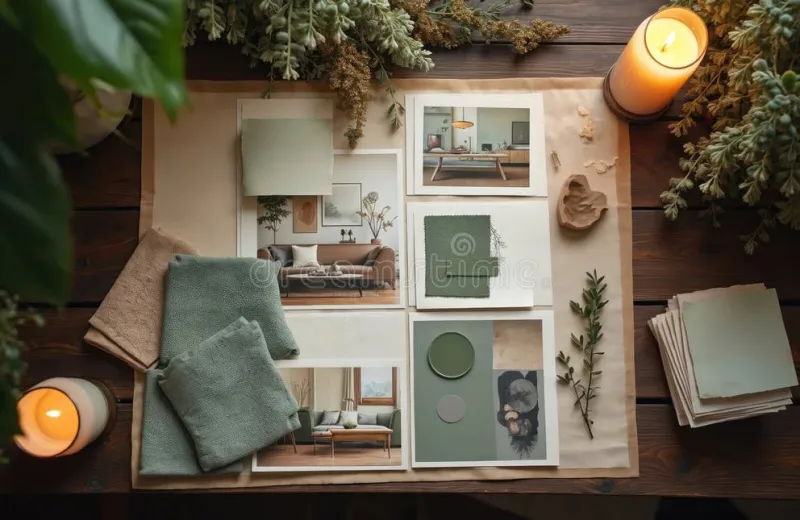
Photo: fabric swatches pinned to mood board on table natural daylight interior design, via thumbs.dreamstime.com
There is a particular confidence with which we now furnish our homes from a phone. A colour looks right on the screen, the reviews are favourable, and the transaction is complete within minutes. Yet ask any interior designer — or indeed anyone who has ever lived with a sofa that turned out to be less 'warm grey' and more 'municipal beige' — and they will tell you the same thing: the screen lies.
Not maliciously, of course. But a backlit display renders colour with its own light source, saturating hues and smoothing textures in ways that no sitting room in Britain can replicate. The fabric that appears crisp and bright online may arrive feeling flat, dull, or unexpectedly cool under a grey Yorkshire sky.
Light Is Local
Colour does not exist in isolation; it exists in light. And British light is famously variable. A north-facing drawing room in Edinburgh receives a cool, diffuse glow that mutes warm tones and deepens blues. A conservatory in Surrey will throw strong southern light across a fabric, bleaching delicate colours and revealing every slub in an unbleached linen.
Order a sample, and you can hold it against the very wall, the very window, the very skirting board it will live beside. Take it there at eight in the morning with the kettle on, and again at dusk when the lamps are lit. You may be surprised how differently the same swatch behaves. A sage green that whispers in daylight can turn almost grey under artificial light; a charcoal weave may reveal warm undertones you never saw online.
Texture Cannot Be Transmitted
Then there is the matter of hand-feel — the weight, the drape, the tooth of a fabric. A website photograph flattens all of this into pixels. Is that boucle soft or scratchy? Does the velvet have a sumptuous depth or a thin, papery finish? Will the Roman blind hold a crisp fold, or does the fabric slouch?
These are not trivial questions. A dining chair upholstery that feels delightful in a photograph may prove unforgiving after a long Sunday lunch. Curtains intended to pool generously may hang stiff and curtain-like rather than languorous. Only by handling the real thing can you judge whether a fabric suits not just the room, but the life lived in it.
The Discipline of the Swatch Test
If you take only one piece of advice from this article, let it be this: never judge a sample on the day it arrives. Unbox it, certainly, but then live with it. Tape or drape swatches in situ and observe them across a full week. Note how they look:
- In direct morning light, when colours are at their most honest and unforgiving
- Under midday sun, which reveals texture and weave detail
- At golden hour, when warm light flatters some palettes and falsifies others
- Under evening lamplight, when the room will actually be used most
Keep the swatch near the skirting and near the ceiling; colours shift subtly with height and reflected light. And if the fabric is destined for upholstery, rub it. A quick test with a pale cloth will reveal whether dye transfers — a small discovery now, rather than a ruined pair of jeans later.
From Swatches to Story: Building a Mood Board
There is a further pleasure in the sample that no digital wishlist can match: the physical mood board. Gather your swatches — the curtain fabric, the blind, the cushion candidates, a paint card or two — and lay them together on the kitchen table. Do they converse or quarrel? A pattern that charmed you online may fight with the weave of your chosen plain; two textures that seemed compatible may, in the flesh, compete.
This tactile editing process is how good rooms are actually made. Photograph the board, pin it above your desk, and let it evolve. Over a fortnight you will find yourself quietly discarding the swatches that never quite sang, until what remains is a scheme that feels inevitable rather than assembled.
A Small Step That Saves Expensive Regret
In a project of any scale, the cost of a handful of samples is negligible; the cost of reupholstering a misjudged suite is not. At Closs & Hamblin Interiors, we encourage every customer to treat samples not as an administrative hurdle but as the most enjoyable stage of the project — the part where the room begins to take shape in your hands rather than in your imagination.
The screen will always be convenient. But style, properly done, is a matter of light, texture and patience — none of which can be compressed into pixels. Order the swatch. Live with it a while. Your future self, sitting contentedly in a room that looks exactly as you hoped, will be glad you did.